Creating and Editing Dashboards (V2)
Last updated: April 17, 2026
Grid lets users visualize metrics in charts, reports, and plans - all three of these elements are called Reports in Grid. Dashboards are a way to group different Reports for different audiences. Each Dashboard can be modified and shared independently of other Dashboards.
Each Dashboard can have multiple reports, and reports can be reused across different Dashboards. This means any change you make to a Report will reflect on every Dashboard that contains that Report.
Creating Dashboards
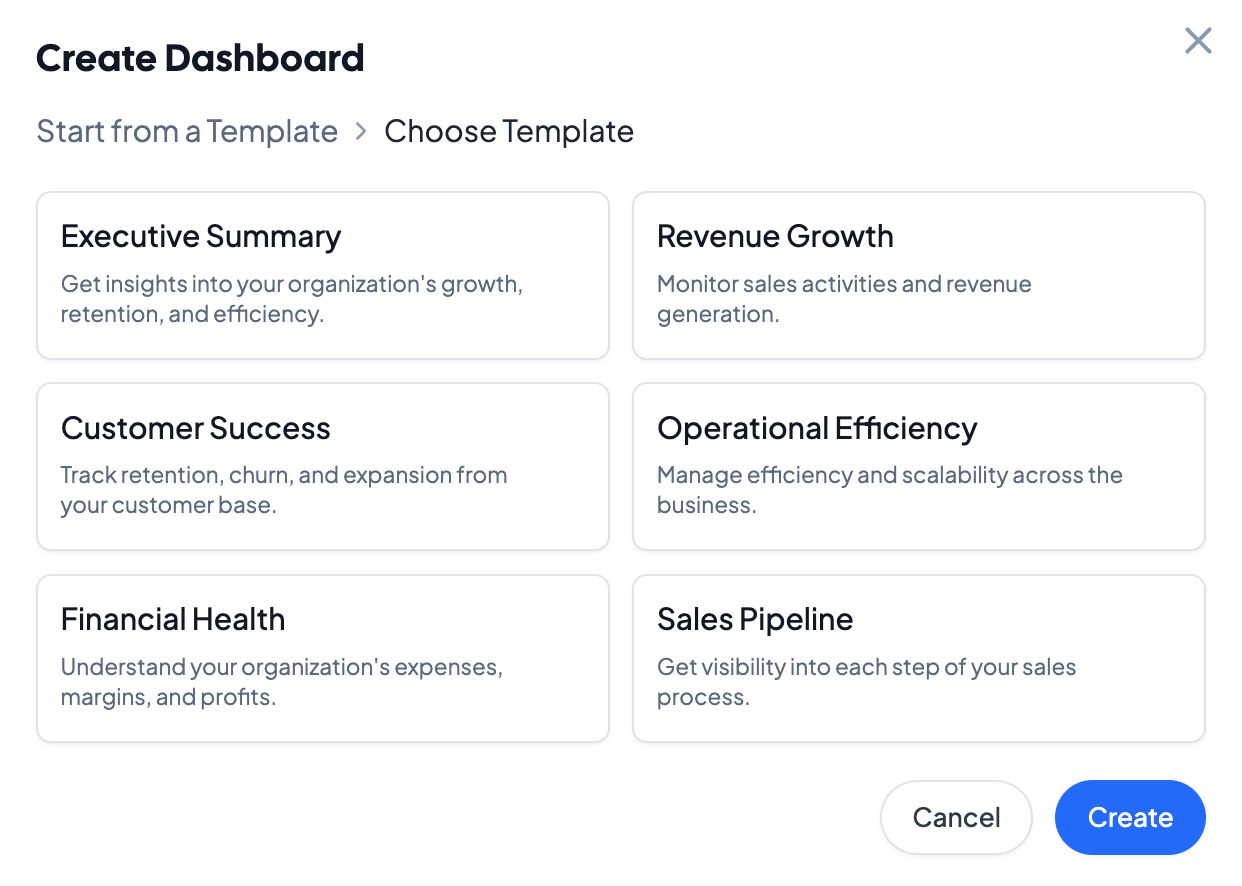
Create a dashboard by clicking on the + symbol next to the Dashboards on the left navigation bar. Choose from a default, persona-based template, or build your own. Dashboard templates come prebuilt with department-specific KPIs, and can be edited and saved as well.
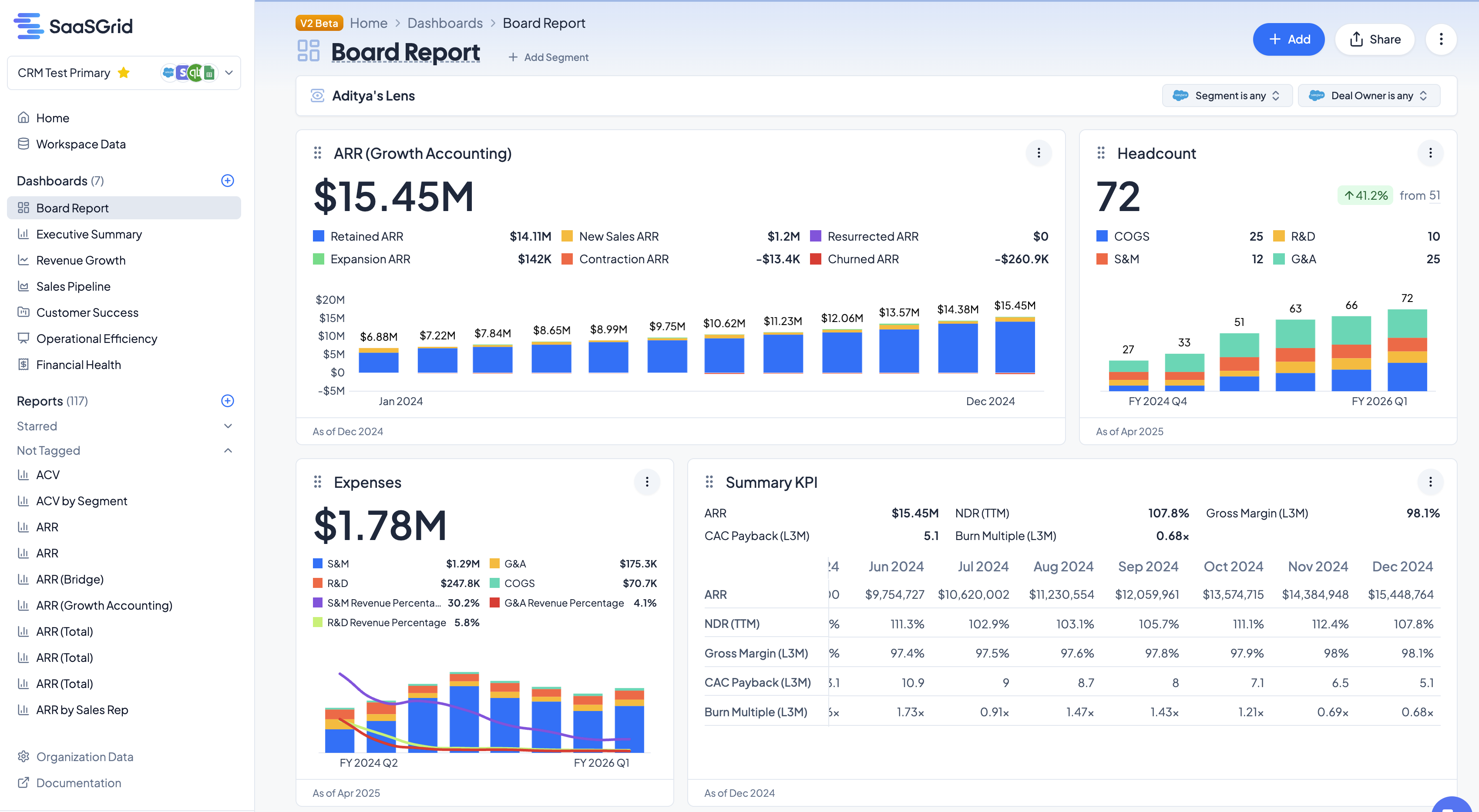
After creating a Dashboard, it will be visible on the left navigation bar under the Dashboards section. Dashboards themselves can be rearranged in the navigation pane.
Editing Dashboards
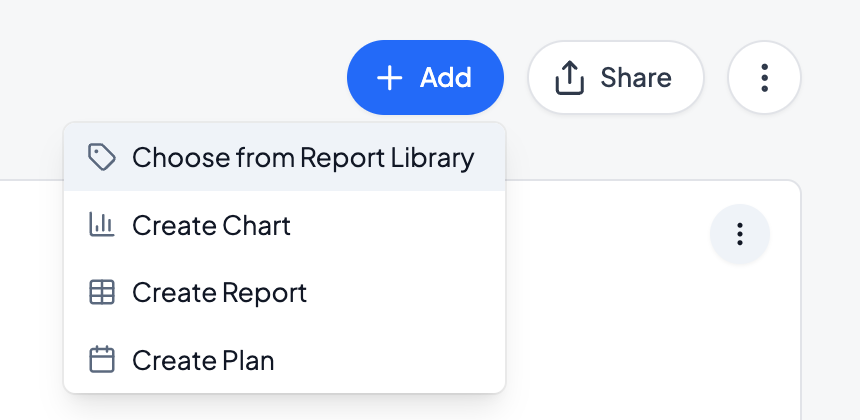
To add a report to a Dashboard, drag and drop an existing Report into a dashboard, or click on the dashboard and add a new Report by clicking on Add in the top right corner of the dashboard.
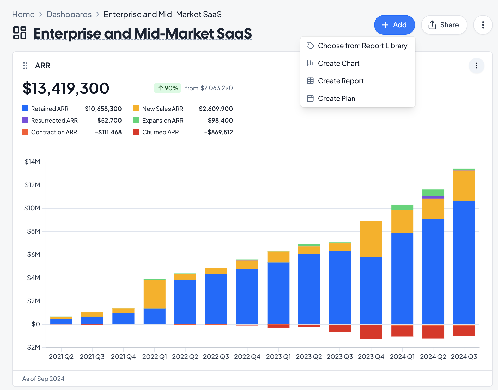
Under Add, you can add existing charts from the Report Library, or create a new Chart, Report, or Plan in the dashboard.
To edit individual Report elements on a Dashboard, click on the three dots in the top right of each report element. Reports in Dashboards can be renamed, expanded or minimized, or configured. All updates to a Report will propagate to other Dashboards that the Report is added to.
Dashboard Settings
In Dashboards V2, each dashboard element can be customized. To edit a card, click on the three dots on the top right of the card and click Edit.
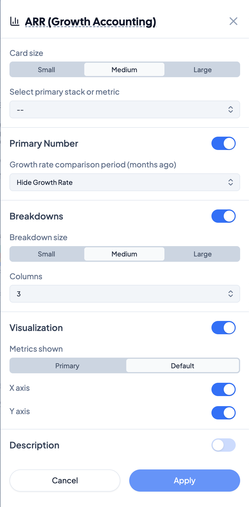
Primary Settings
Card Size indicates the size of the card on the dashboard. Choose if charts should be small, medium, or large on the dashboard page.
Select the primary stack or metric indicates what metric should be visible if Primary Number is selected.
Select a growth rate with Growth Rate Comparison Period, and select how many periods to use for the comparison period, as well as the aggregation for the growth rate. This value will appear on the chart in the top right.
Breakdowns
Breakdowns toggles a legend with subcategories, complete with values for the latest period.
Breakdown size indicates the text size of the list of breakdown categories. Choose from small, medium, and large text.
Columns indicates the number of columns that Grid should distribute the legend across. Grid defaults to the number of columns that will fill the card.
Visualization
Visualization toggles the chart on the card - turning this off will hide the chart component of the card.
Metrics shown indicates if only the primary metric should be displayed, or if the default categories should be shown for the card.
X axis and Y axis toggle the axes on the chart.
Description toggles an editable description for each card.