Chelsey Fang
Last updated: 14 June 2025
SaaSGrid lets users visualize metrics in charts, reports, and plans - all three of these elements are called Reports in SaaSGrid. Dashboards are a way to group different Reports for different audiences. Each Dashboard can be modified and shared independently of other Dashboards.
Each Dashboard can have multiple reports, and reports can be reused across different Dashboards. This means any change you make to a Report will reflect on every Dashboard that contains that Report.
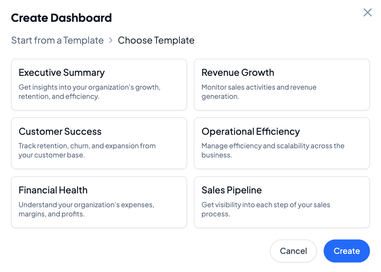
Create a dashboard by clicking on the + symbol next to the Dashboards on the left navigation bar. Choose from a default, persona-based template, or build your own. Dashboard templates come prebuilt with department-specific KPIs, and can be edited and saved as well.
After creating a Dashboard, it will be visible on the left navigation bar under the Dashboards section. Dashboards themselves can be rearranged in the navigation pane.
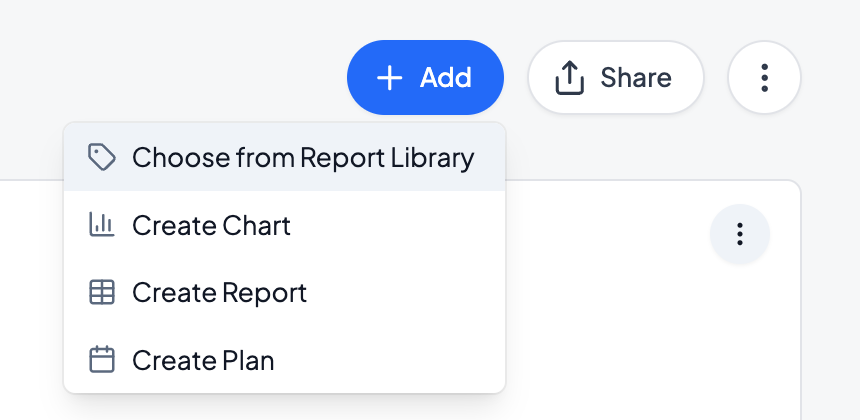
To add a report to a Dashboard, drag and drop an existing Report into a dashboard, or click on the dashboard and add a new Report by clicking on Add in the top right corner of the dashboard.
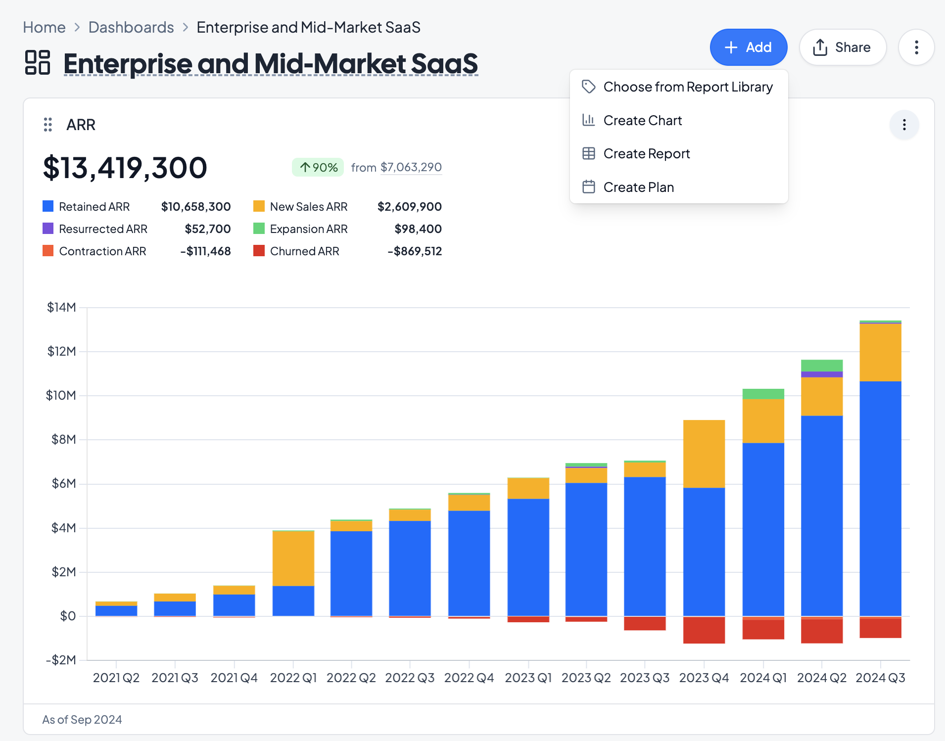
Under Add, you can add existing charts from the Report Library, or create a new Chart, Report, or Plan in the dashboard.
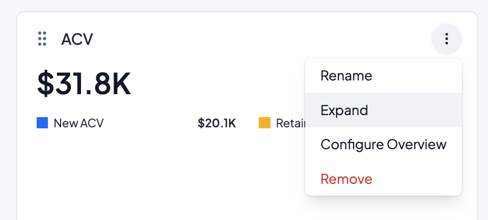
To edit individual Report elements on a Dashboard, click on the three dots in the top right of each report element. Reports in Dashboards can be renamed, expanded or minimized, or configured. All updates to a Report will propagate to other Dashboards that the Report is added to.